Click the image to view the website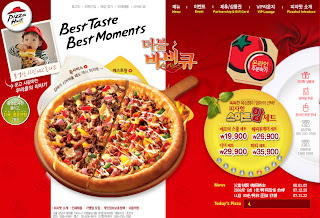
Obviously this is a pizza hut website. The slogan with Best Taste Best Moments, sounds like 1 now 1 Nescafe. Hahaha, even the colour mode also look alike same with the Nescafe website.
The website is in Korean language, i think it because their target audience is in korean country. Although is Korean language but for main navigation they have English language to represent the Korean word. For the sub navigation they even provide a graphic image to represent it. The button with graphic image, actually provide online service to ordering pizza but just for Korean country. The background colour in this page it enhance the hot and crunchy of pizza image. Besides the background image is not dull it add some element to enhance the overall feeling of pizza hut.
When you enter the website, your eye surely will see the large pizza image. It actually promoting their famous favour pizza, and let you feel the delicious of pizza but i think add in some smoke will be more delicious. As the main page is just a introduce, the details is inside every button. They even provide a video to teach how to online oder the food.
For sub pages their banner is really caught my eye attention, it because of some little flash then keep attracting me. For content, they even have provide price and some nice food image to approach user to order it.
But for the truth, the sub pages is look more comfortable compare to main pages.
The grid for main page is quite complicated maybe it using flash.
For sub pages the grid is more simple and nice, everything is flash but just content is not flash.
迈向梦想的路上
9 years ago
No comments:
Post a Comment